The web is an amazing and vast resource. And we find ourselves using it more and more. I was thinking the other day how I haven’t used the Yellow Pages or picked up a map in years. It’s so much more convenient to just look things up on the web.
But when we surf the web, we’re at the mercy of web designers. Sometimes the useful information we seek is rendered unreadable, unusable, or simply annoying by web designers who think they are being unique when they are actually just being a pain.
Older users of the web will remember GeoCities. GeoCities was the first site to make personal web pages possible. And there was an explosion of hideousness the world has seldom seen before or since. Light yellow text on hot pink backgrounds with images of dancing hamsters floating through the text. White text over a background of a printed circuit board. The choices were limitless. And people tried them all.
While things have calmed down a bit, it’s still far too common to come across a web page that’s just not readable. Usually, I just move on. But what if it’s something I’m really interested in?
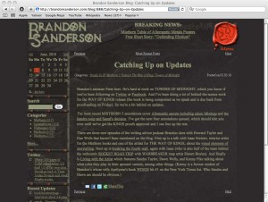
Take a look at the following page. It’s from Brandon Sanderson’s blog <http://brandonsanderson.com/>. Brandon is a New York Times bestselling fantasy writer. He blogs, has a podcast, and tweets about the writing process. It can be interesting stuff. Sadly, his blog design is truly horrible:
Yellowish-greenish text over a black background would be bad enough. But they’ve added a background pattern behind the text in the same color as the text, just a lighter shade. It’s bearable for a short entry like the one above. But longer entries can be maddening to read and tiring for the eyes.
I used to select the text like this and copy and paste it into Text Edit where I had complete control of it. Change it to black, Palatino, 13 point and I was able to see and read it comfortably. And there are some other tricks that I was going to present here. But Safari 5 came out instead.
Safari 5 to the rescue.
For pages that appear to have articles, posts or other lengthy text, Safari 5 has a new feature called “Reader”. Notice in the address bar in the above image. There’s a new blue-grey tag that says Reader.
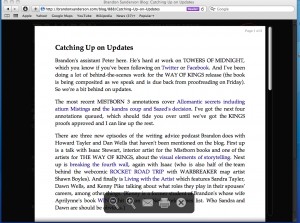
Click on it. And you’ll get something like the following:
The same information is now presented in a larger font, with serifed black text on a white background. You can zoom in or zoom out on the text, email or print it. When you’re done, dismiss it to go back to the original page. If the article is spread out over several web pages, Reader will try to suck them all in and present them all in one continuous read. So you won’t have to keep clicking Next to move on and it’s easier to print or email.
Position the cursor in the bottom section of the window to get the pop up icon window. Click the X to dismiss the Reader view. Or, click Reader again in the address bar.
If you go to a site and don’t see Reader in the address bar, Safari wasn’t able to find an article (because of the way the web page was formatted) and you’re on your own. But it works most of the time. And when it does, it’s a godsend for people who read a lot on the web, or who read the occasional badly designed site.


